Styling · The Colour Trend
The Acidic Hues
Beige asked nothing of you. This asks for an eye.
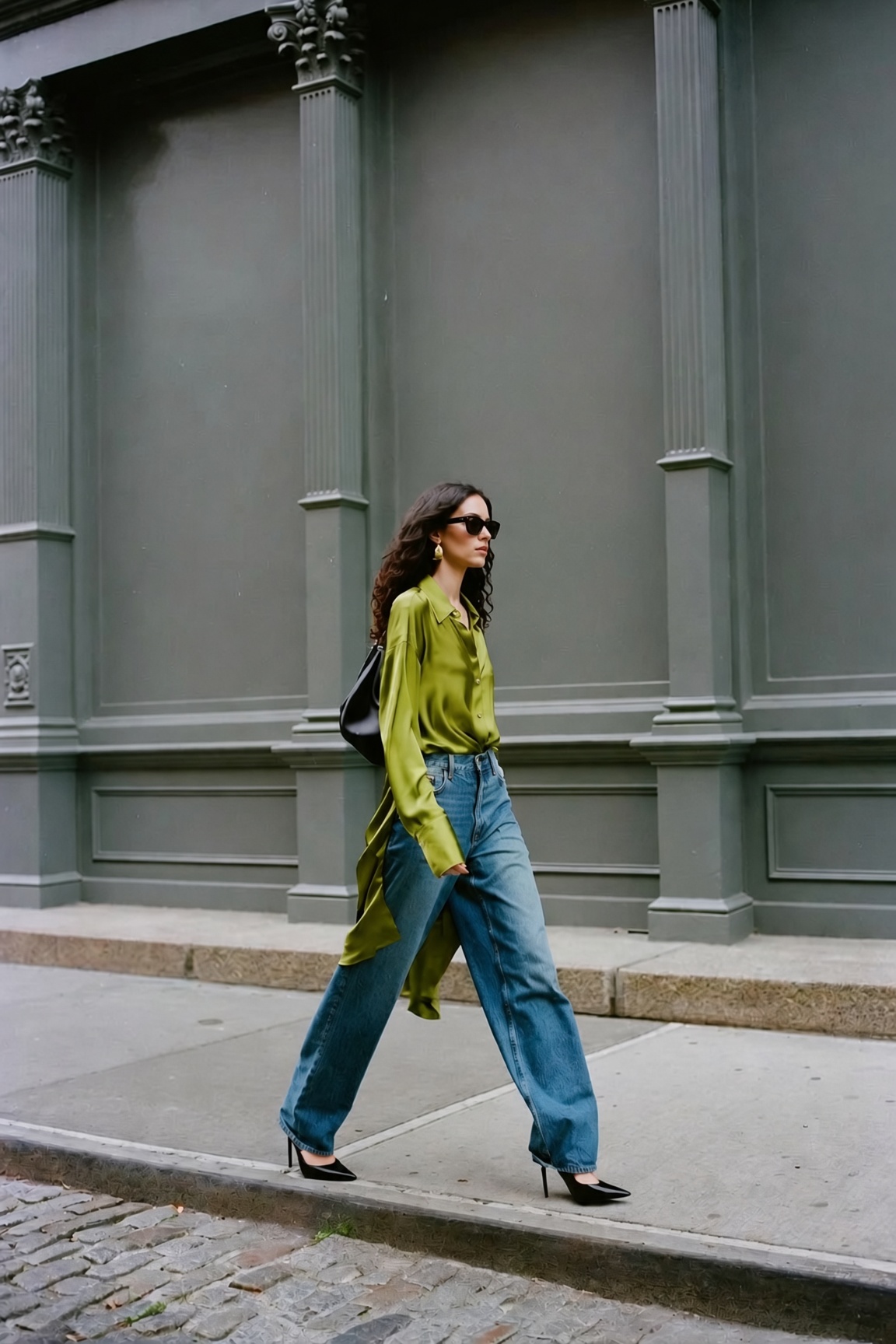
Beige asked nothing of you. This asks for an eye.
For twenty years the fall wardrobe has been the same eight colours. Camel, cream, black, beige, grey, navy, and burgundy and olive for depth. It was called quiet luxury and it worked, because a quiet palette implied you did not need to try.
Then everyone learned it. A beige knit over black jeans with a loafer is now available at every price and on every high street, which means it stopped signalling anything at all. The moment restraint became universal, restraint stopped being expensive. And the signal moved.
Where it moved to is a colder, louder palette. Chartreuse, cobalt, violet, saffron, cherry. All of them saturated, and crucially all of them cool-toned, which is the reason they read as autumn rather than as leftover summer. A chartreuse coat sits correctly against November light in a way a coral one never could.
The houses making the case are the ones that never abandoned colour. Dries Van Noten and Miu Miu both sent acid greens down the fall runway. Roksanda has built two decades on exactly this, and this season the rest of the industry caught up. Alaïa put deep violet into velvet and jersey. Chloé made a nine-thousand-dollar gown in a yellow nobody was cutting two years ago.
The difficulty is that this palette asks something of you. A neutral outfit requires no decisions — that was the appeal, and also the reason it stopped meaning anything. A saturated one requires an eye. You have to know which red goes against black, why a matte purple works where a shiny one looks costume, and when a colour needs volume around it to stop shouting.
The rule is one acid piece and everything else quiet. The blazer over black. The trouser under a plain knit. The dress with a shoe that says nothing. Two of these colours in one outfit is not confidence, it is a colour wheel worn as clothing. And burgundy, for the first time in years, is not invited.
This is not an edit for anyone who found beige comfortable. It is for the woman who wants to be remembered in a room — the chartreuse, the mustard, the blue, the red and the purple.
Mine is the Alaïa velvet midi in navy-violet. The pile holds the colour in its depth, not on its surface — which is why it will outlast the season that brought it.— K.W., Editor-in-Chief
One acid piece against black or brown. A plain leather bag, a plain shoe, no second colour anywhere.
The saturated dress, bare. One gold earring. The colour is already the jewellery.
Chartreuse with camel. It should clash and it does not, because both are warm underneath.
Lime and olive-chartreuse — the hardest colour in the edit and the one that defines it. Saint Laurent, Roksanda, Sablyn and Dries Van Noten.
Satin is the wrong finish for most acid colours and the right one for this. It reads as light rather than paint.
The house has built twenty years on colour blocking. This is what that looks like when it stops blocking and commits to one.
A V-neck breaks the colour at the throat, which is what stops chartreuse overwhelming a face.
The house that put this colour on the fall runway. A shirt is the easiest way to test whether you can wear it.
Acid on the leg rather than at the face. If the colour frightens you, start here.
Mustard-gold, the warm end of a cool palette — and the only one that flatters everyone. Chloé, Roksanda, Tove and Reformation.
Nine thousand dollars of silk muslin in a colour nobody was making two years ago. The most expensive thing in the edit.
The cape is the reason it works. Volume takes the heat out of a colour this saturated.
Between olive and gold, which is the most wearable place a chartreuse can sit.
The quietest price on the page. A cropped trouser is the lowest-risk way into the whole trend.
Tap any piece below to shop the whole edit.

Royal cobalt — the blue that photographs. Valentino, Gabriela Hearst, Versace and AGOLDE.
Tonal floral, so the pattern only appears when the light moves. Colour and print in one piece without fighting.
A blazer is where colour becomes usable. Over black, it is the entire outfit and nothing else has to happen.
Belted at the waist, straight through the leg. Silk satin in this blue is the least subtle thing here and it earns it.
A border rather than an allover motif. The house at its most restrained, which is not a phrase it hears often.
Fleece in cobalt should be sportswear. The cut is what keeps it out of the gym.
Knitted, so the colour has depth rather than sitting flat. It moves like a jersey and holds like a coat.
Under three hundred, in cotton, in the season’s blue. The single easiest purchase on this page.
Blue-red, never orange-red — the version that works against black. Carolina Herrera, Heirlome, Alex Perry, Nili Lotan and Courrèges.
Gathering catches light differently across the body, so a flat red stops being flat.
Crepe rather than satin. Matte red is more serious than shiny red, and considerably harder to find.
Print and colour together, on a turtleneck, full length. It should be too much. The jersey is why it is not.
Cable knit in cashmere, belted at the waist. The most useful red here and the one that survives past this season.
Under seven hundred for a silk maxi in the right red. Rare enough to mention.
A rollneck puts the colour directly under the face, which is either the point or the problem. Here it is the point.
Violet, plum and indigo — the loud colour that behaves like a neutral. Alaïa, Fforme, Christopher Esber, Dries Van Noten and Joseph.
Deep, rich pile — the only cloth that holds a dark purple as colour rather than letting it collapse into almost-black. The fabric is doing the work here, not the cut.
The house cuts jersey better than anyone. Asymmetry means the colour moves across the body rather than sitting on it.
Full length and unbroken. The most committed piece in the edit and the least fussy.
Draped rather than cut, so the indigo pools and shifts. A blouse doing the work of a dress.
Plum velvet against black trousers is the whole trend in one purchase.
The house does quiet better than loud, which is exactly why its purple is wearable.
Cutouts and ruching on a saturated colour. Under five hundred and twenty, which is the surprise here.
Every piece in this edit, by the houses behind it. Explore them all.
Beige stopped being a signal the moment everyone could afford it. One saturated colour, worn on purpose, is the harder thing — which is exactly why it works.— ESVRA